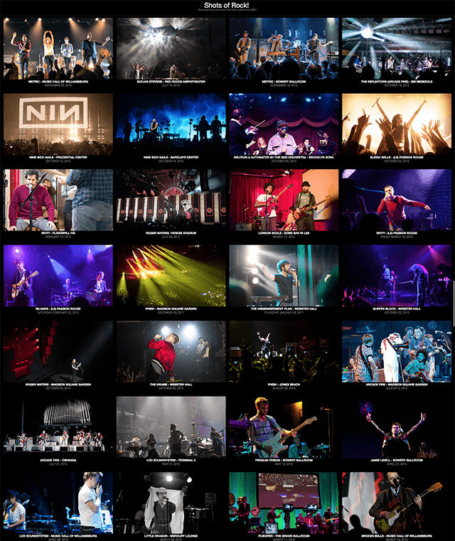
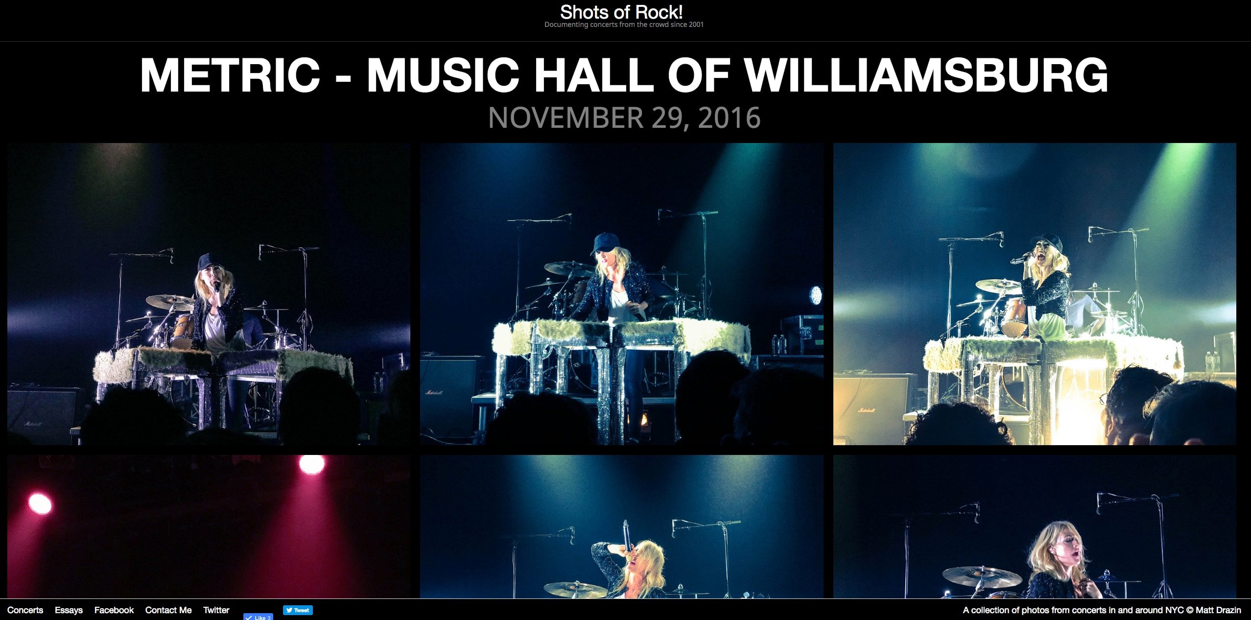
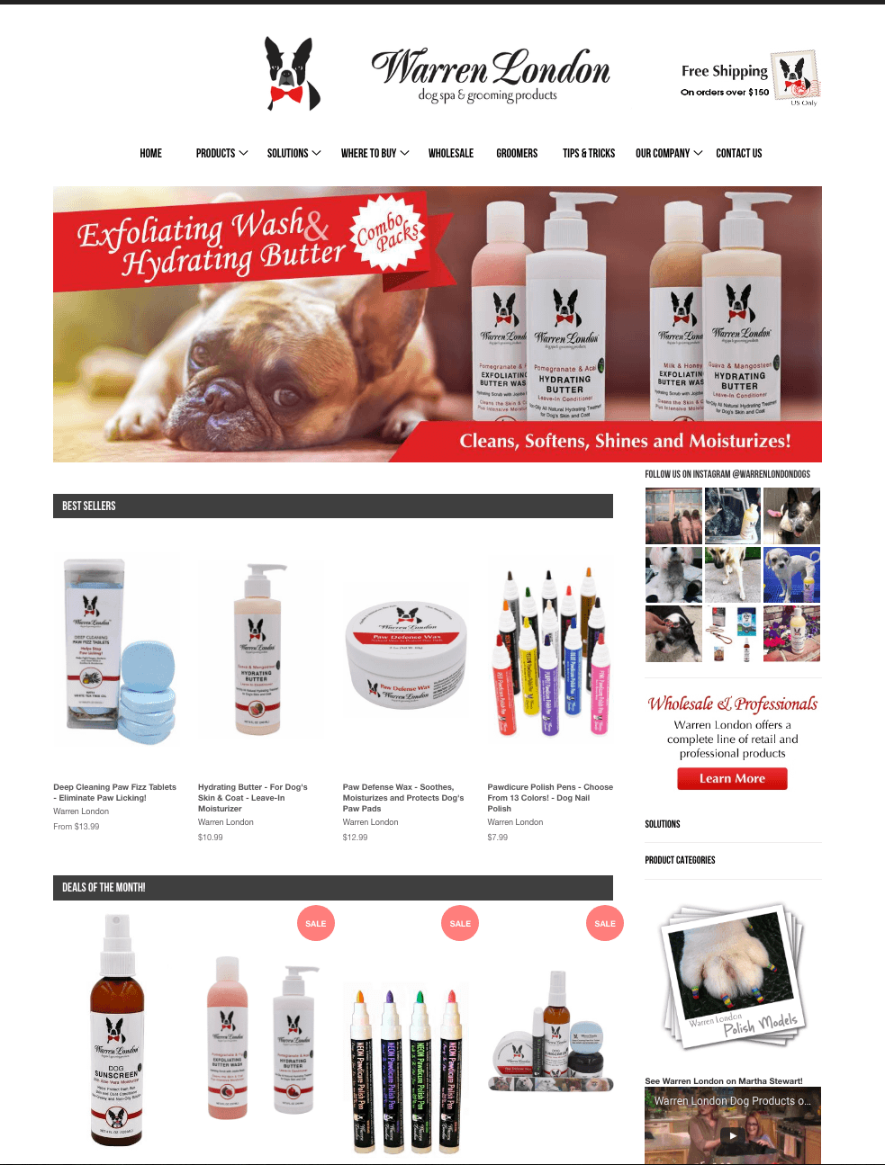
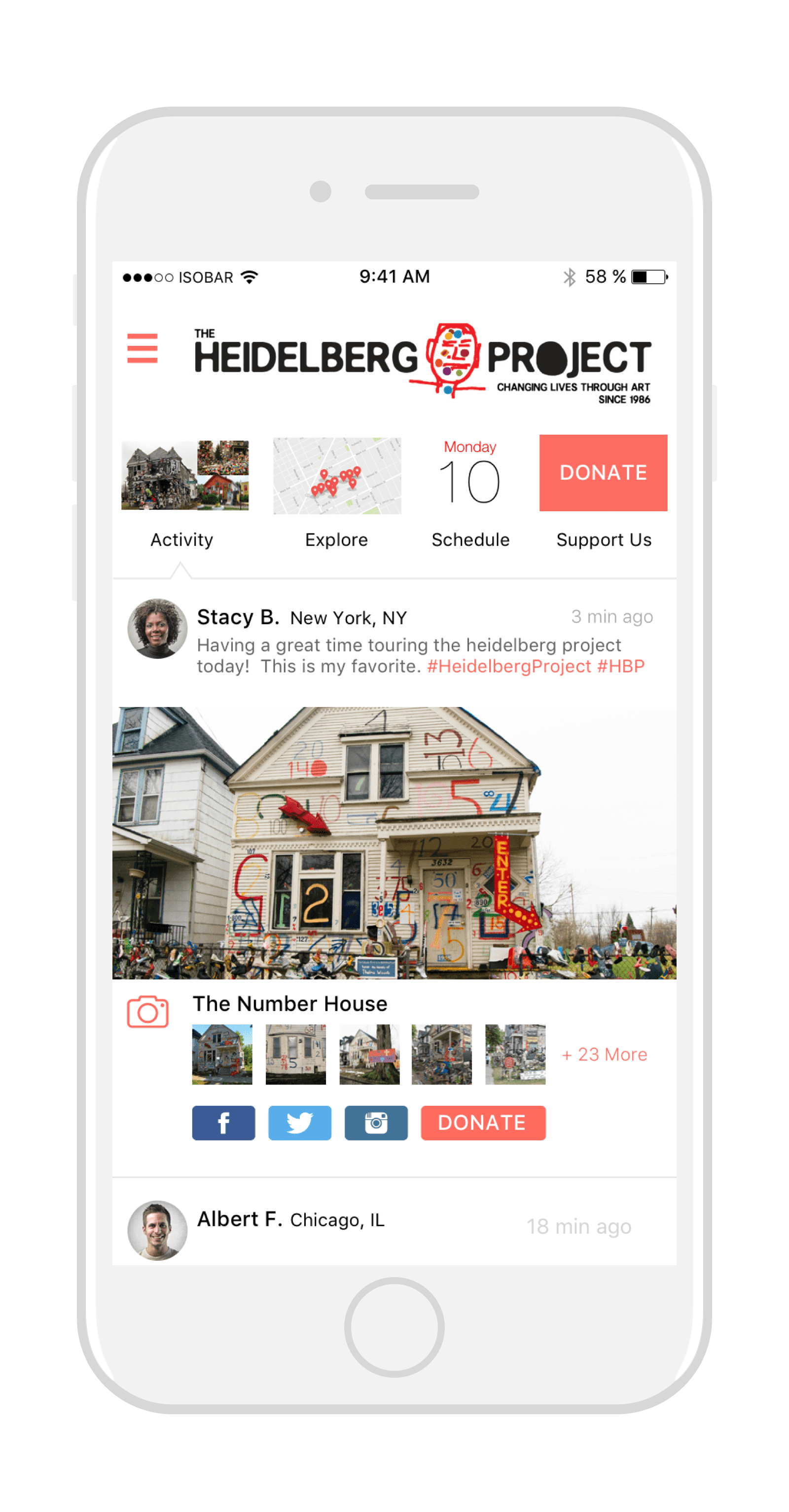
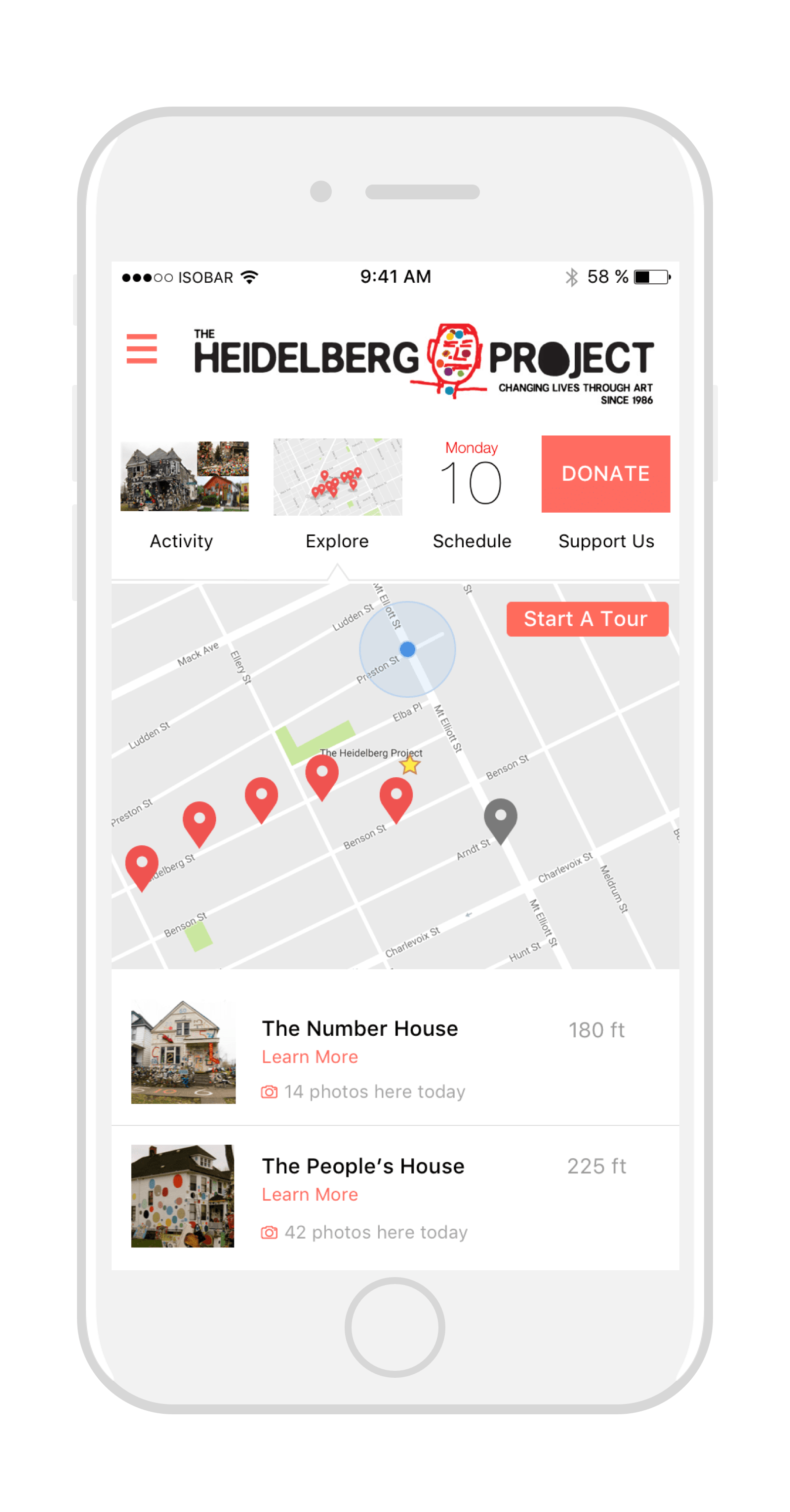
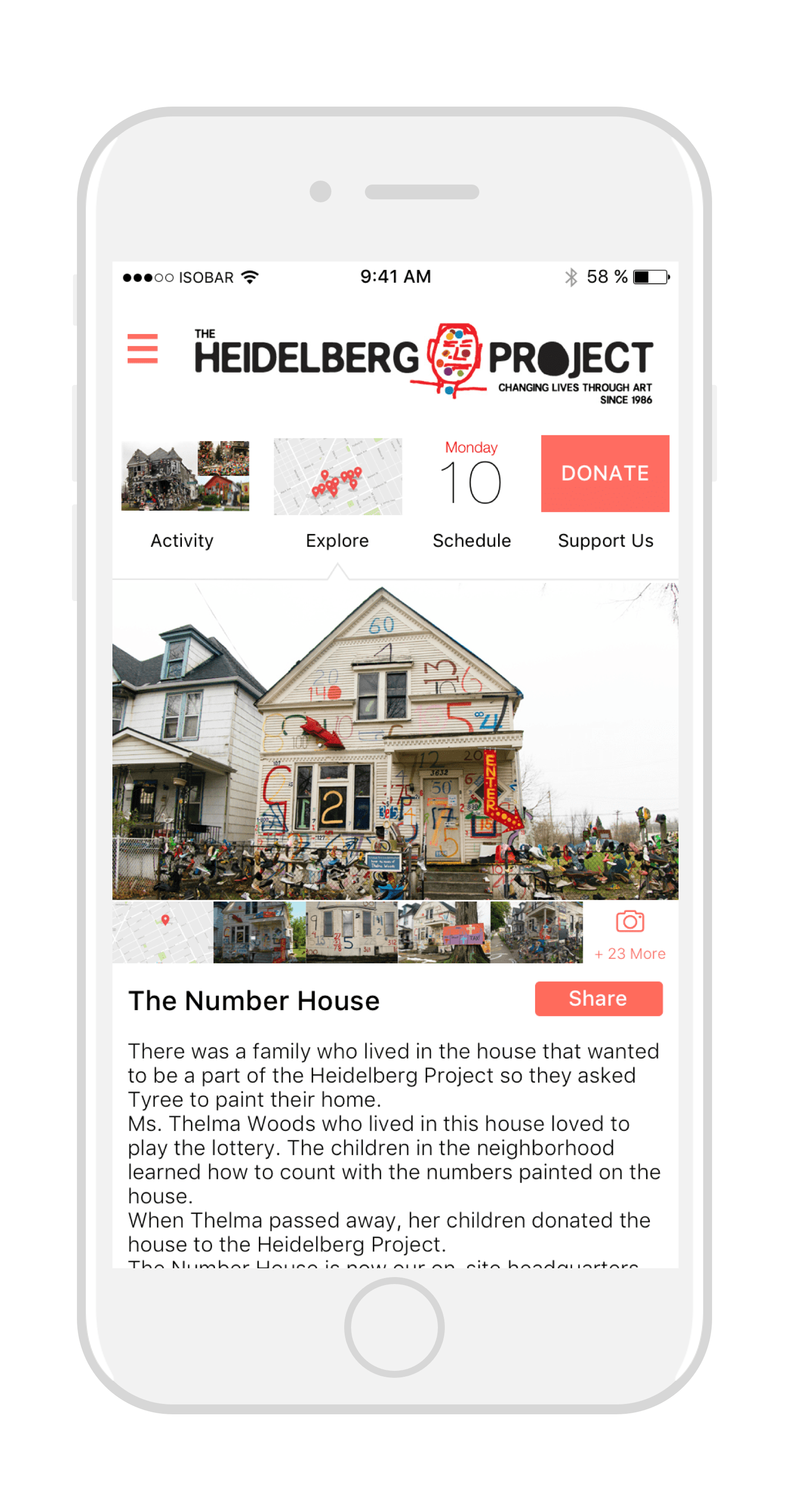
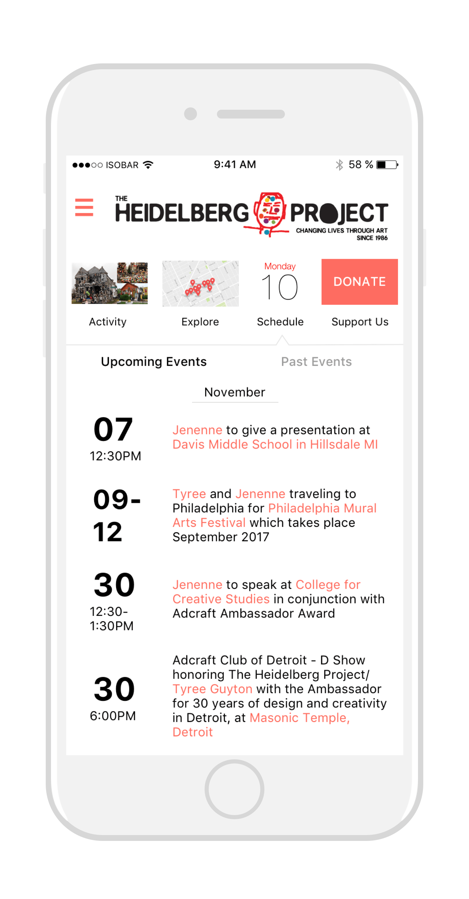
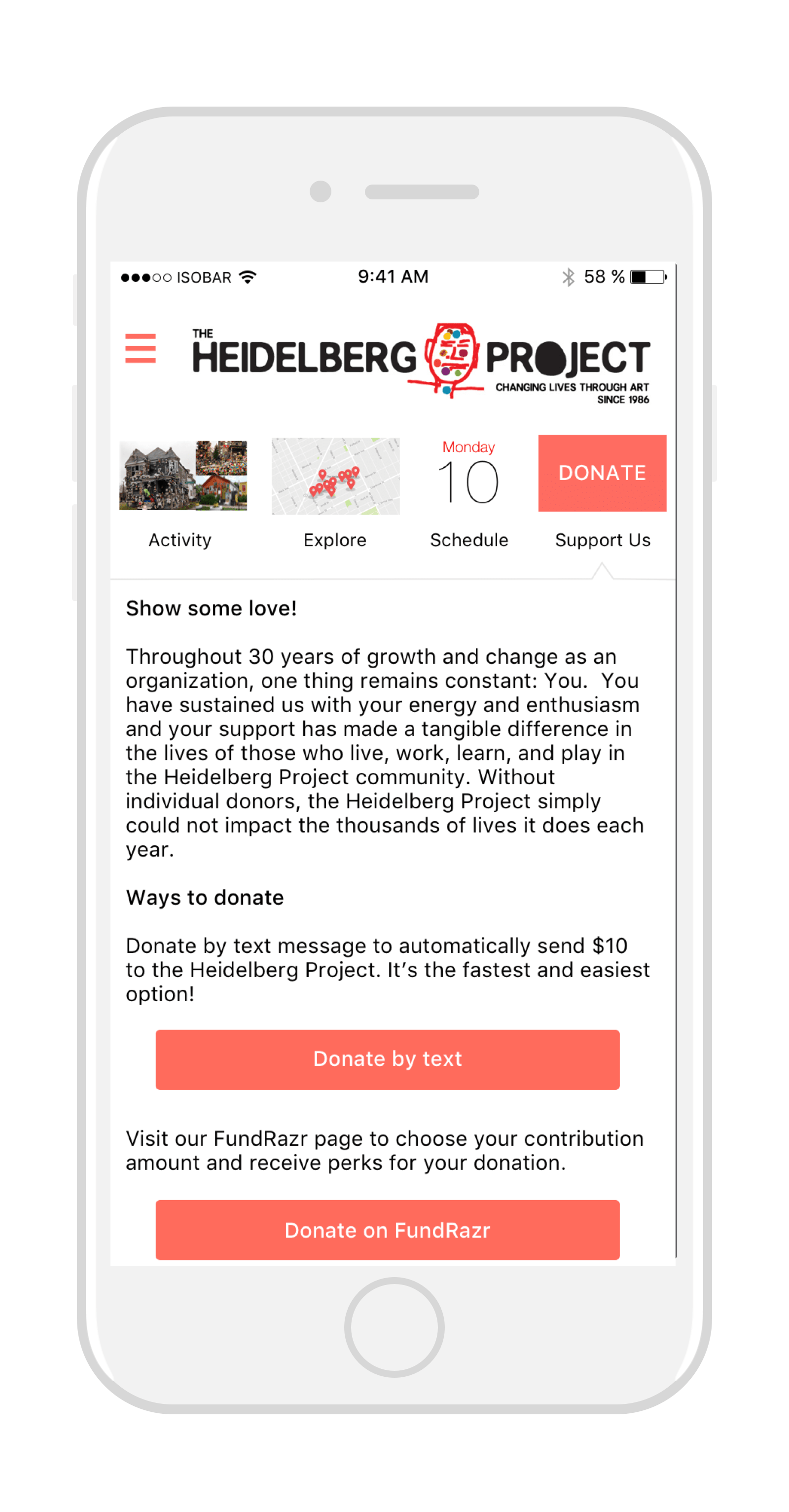
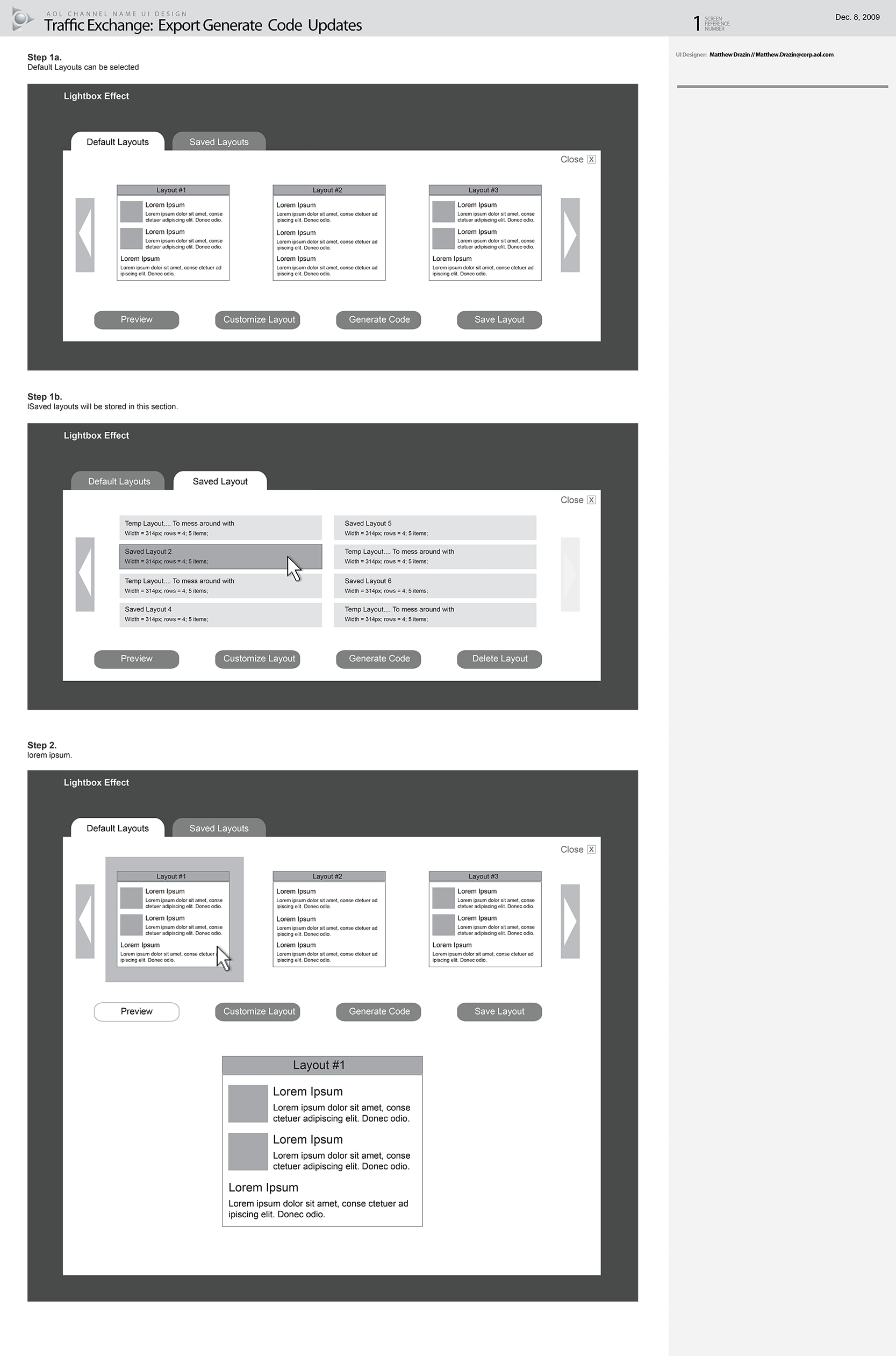
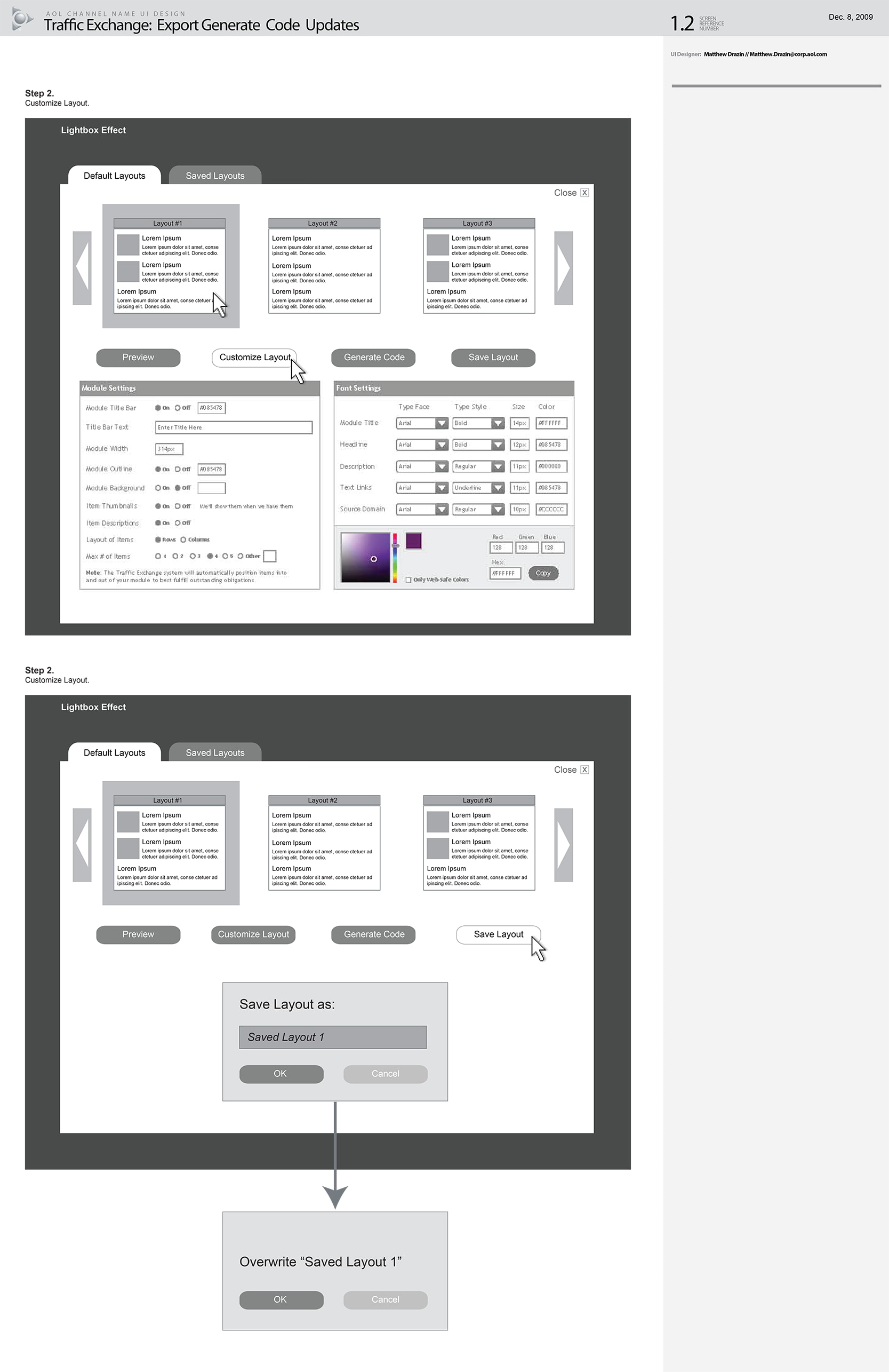
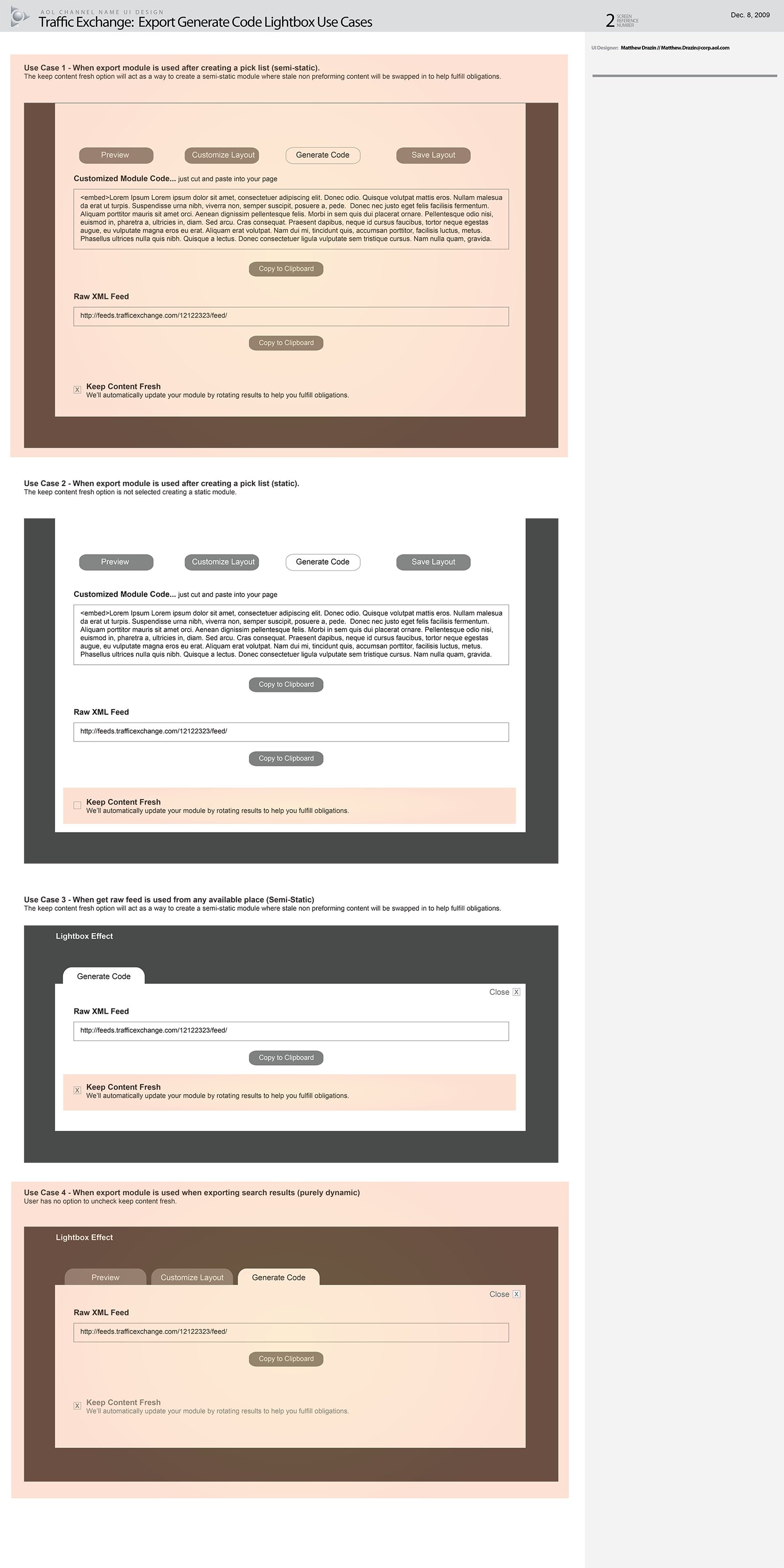
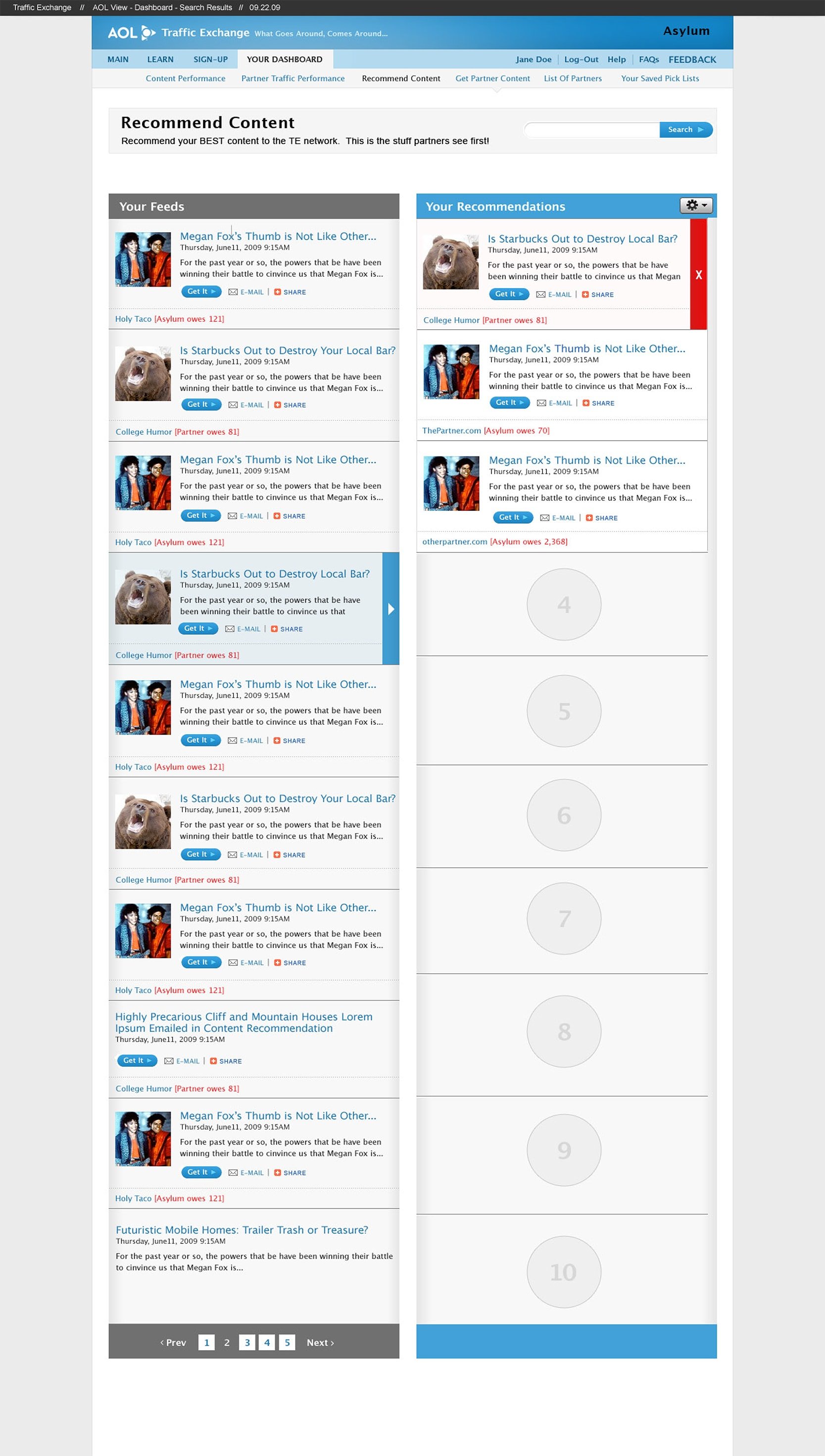
Portfolio
These are just a few of my public-facing personal projects and some excerpts from some client work. If you would like to see some more client-focused work samples, and process or methodology examples, Contact Me and we can talk.
These are just a few of my public-facing personal projects and some excerpts from some client work. If you would like to see some more client-focused work samples, and process or methodology examples, Contact Me and we can talk.
I am a holistic thinker who cares deeply about design. I'm passionate about solving complex user-centric problems and making products and services I would use. With over twelve years of experience at both agencies, start-ups, and in-house teams, I've harnessed a thorough and up-to-date working knowledge of user interface design principles and methodologies. I can incorporate knowledge of human factors, user-centered design processes, interaction design guidelines, patterns, usability methodologies, industry standards, trends, unique methods of inquiry, and platform standards to create world-class designs.
I’ve worked across various industries creating some of the most forward-thinking and usable products. From ideation, validation, conceptual design, detailed design, and development to support.
I’ve conducted user testing in multiple countries and led user and client brainstorms & workshops for ideation and requirements gathering.
I’ve built and led teams of both UX and Visual Designers while forming and maintaining a unified vision and voice. I've developed a methodology to rapidly incorporate visual design into UX deliverables.
I work on long, detailed, and complex projects with layers of problems both organizational and user-related. These projects last in some cases for years. I dedicate myself, own the space, and see projects through to the end.
Currently - Associate Director, Experience Strategy & Design
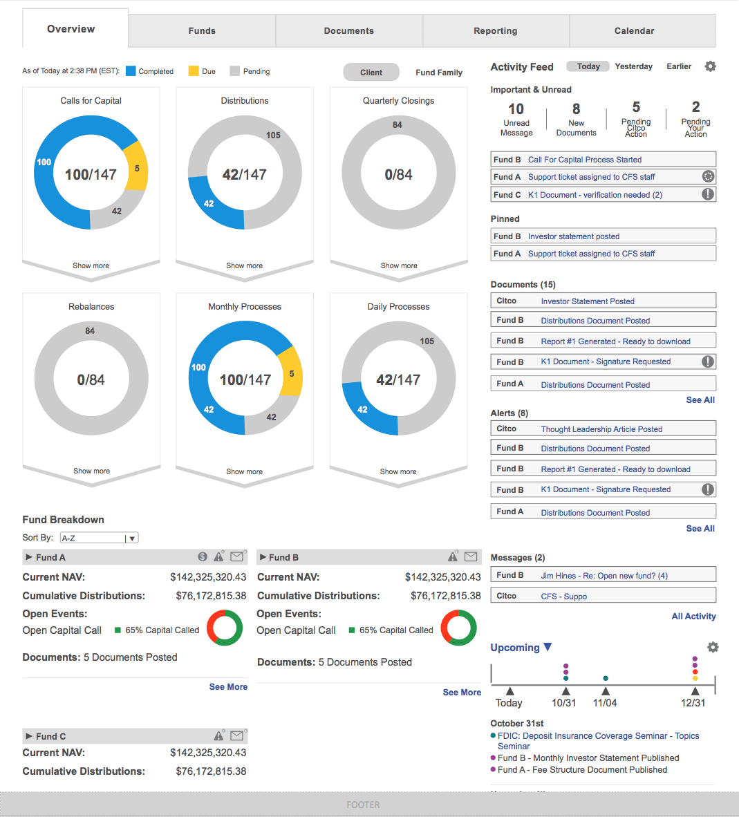
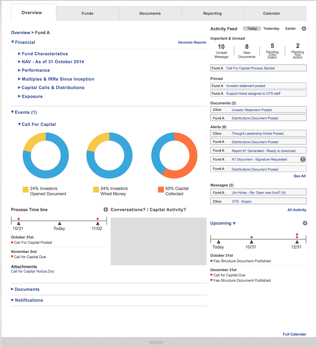
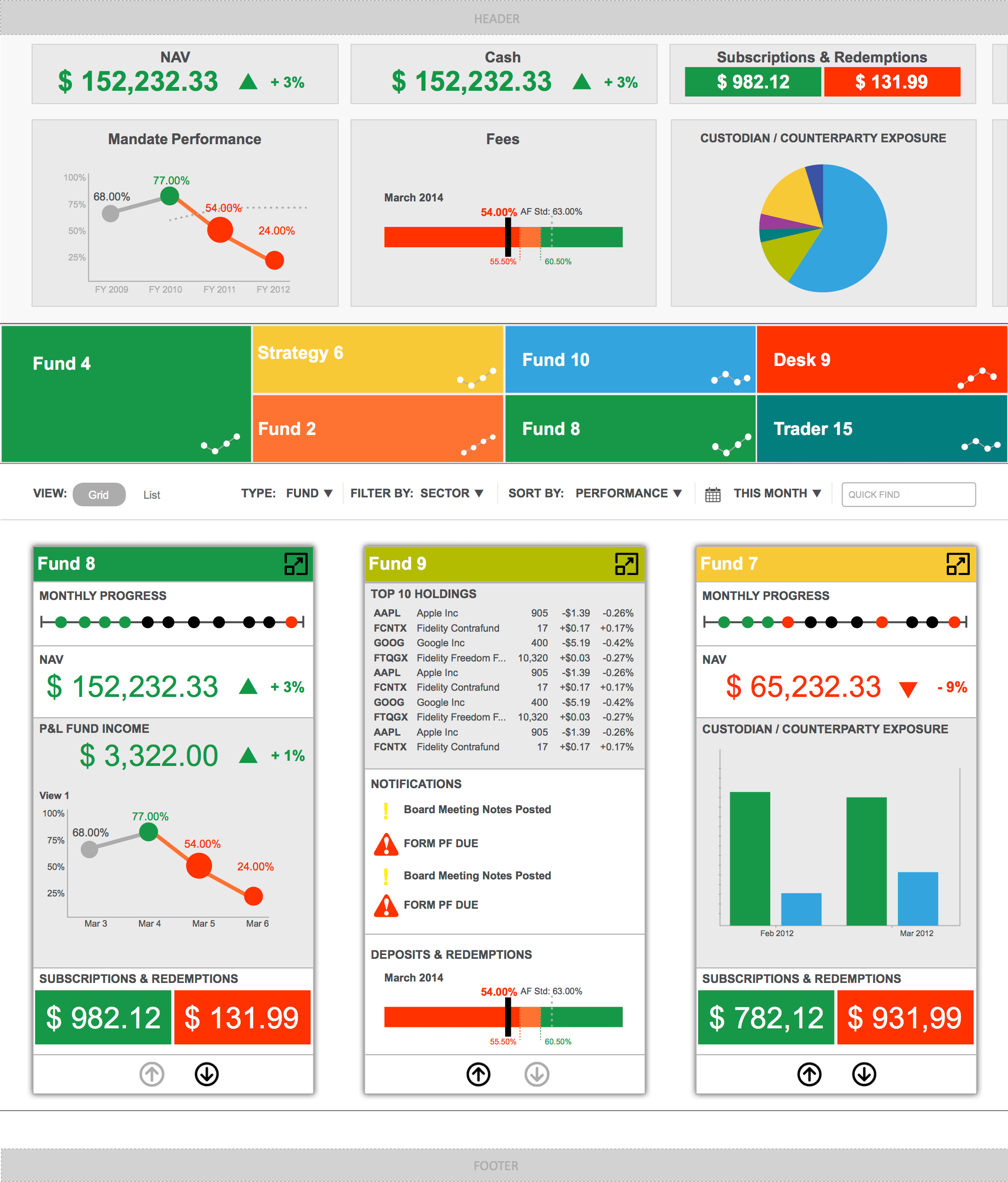
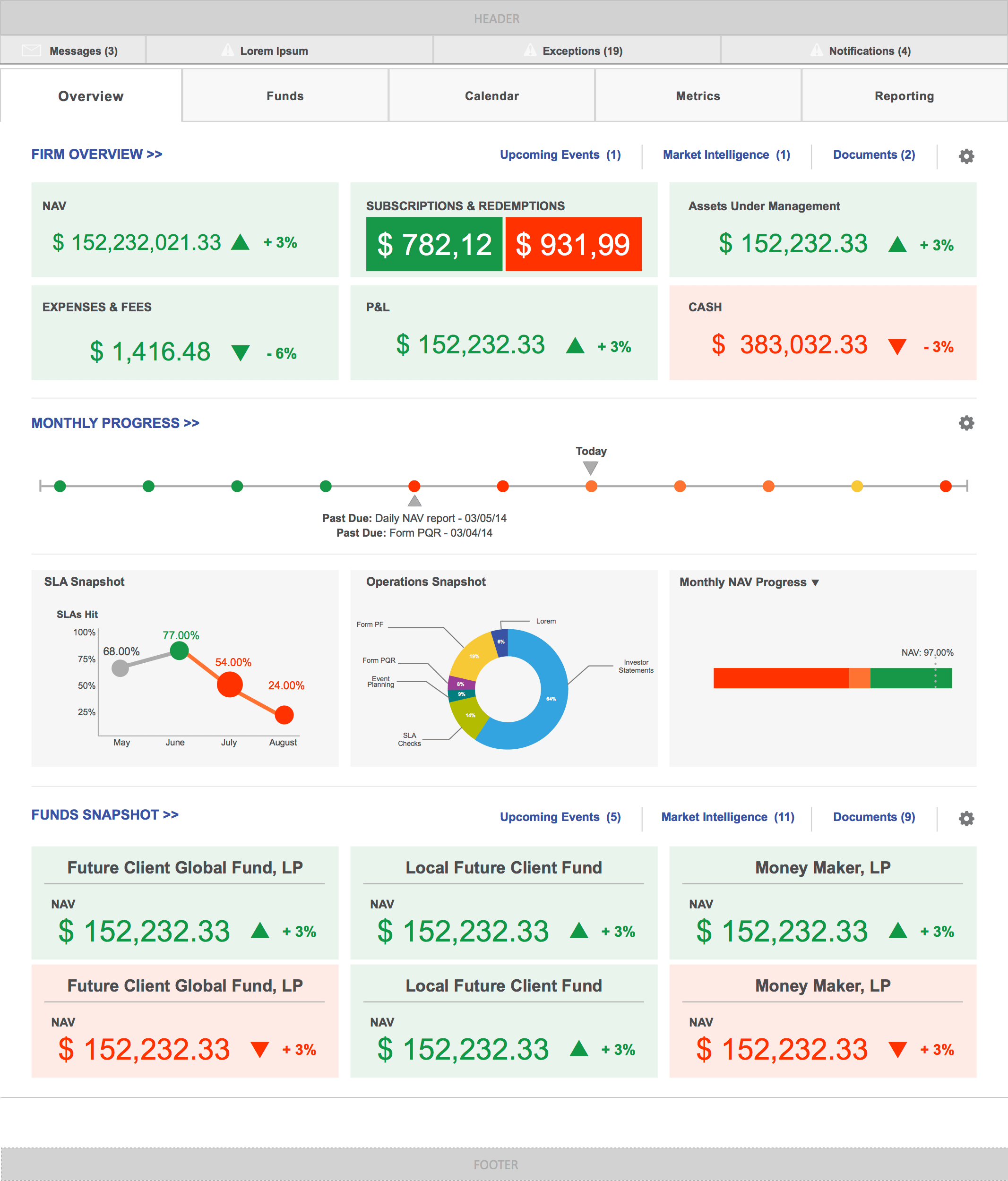
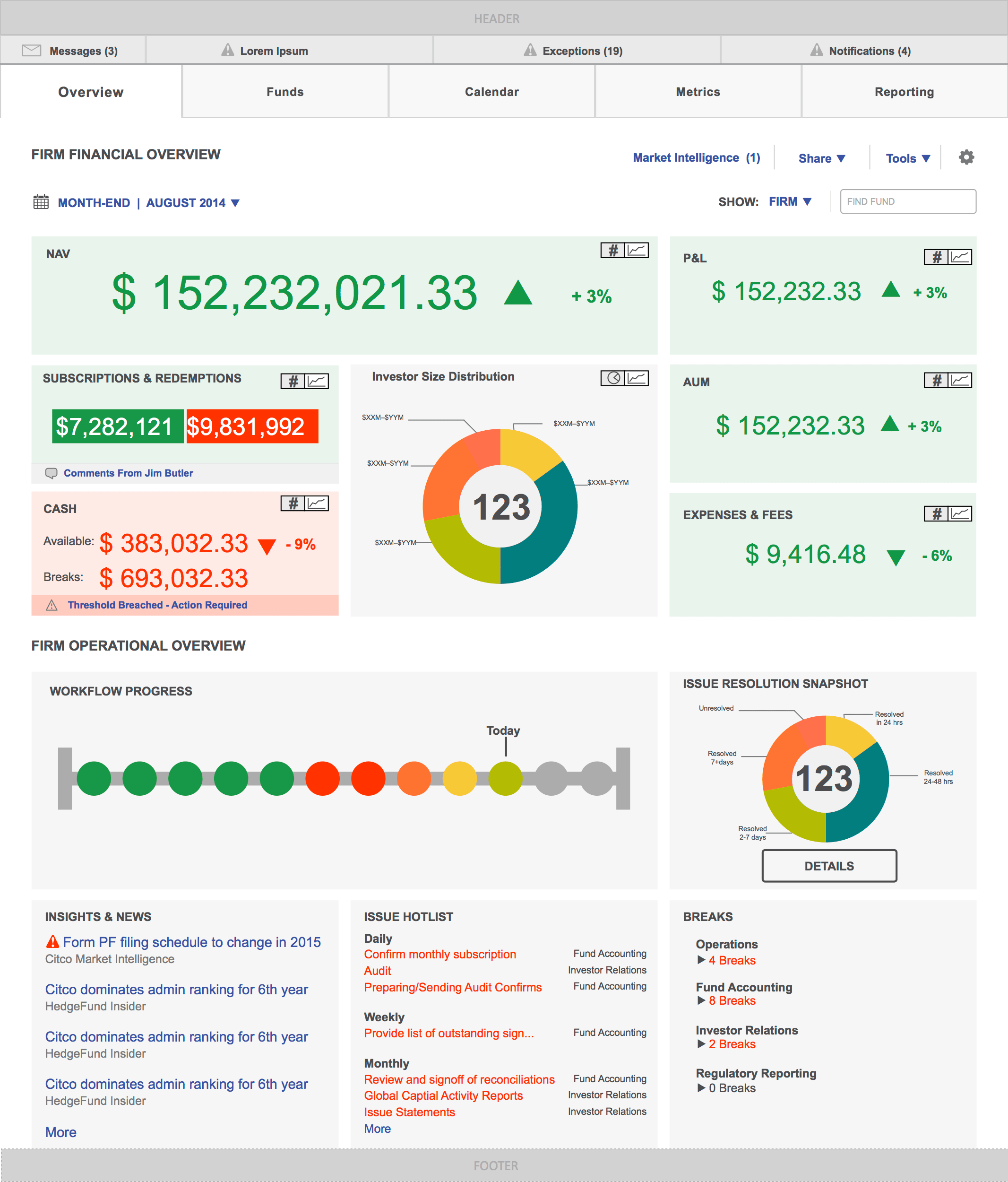
Manage day-to-day operations of both UX & Visual Design teams producing strategic thought leadership and a detailed design system and documentation for the future banking portal for the largest private bank, Brown Brothers Harriman.
Conceived an experience framework and managed a multi-threaded site redesign for Sotheby’s the leading broker of fine art, jewelry, and collectibles, capped by high net-worth user testing in multiple countries.
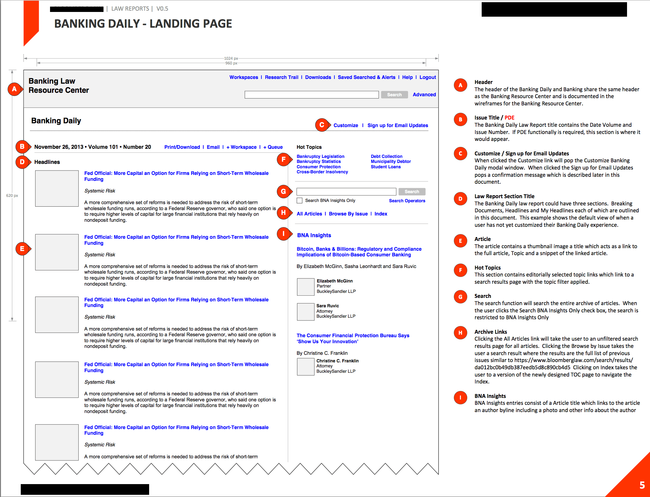
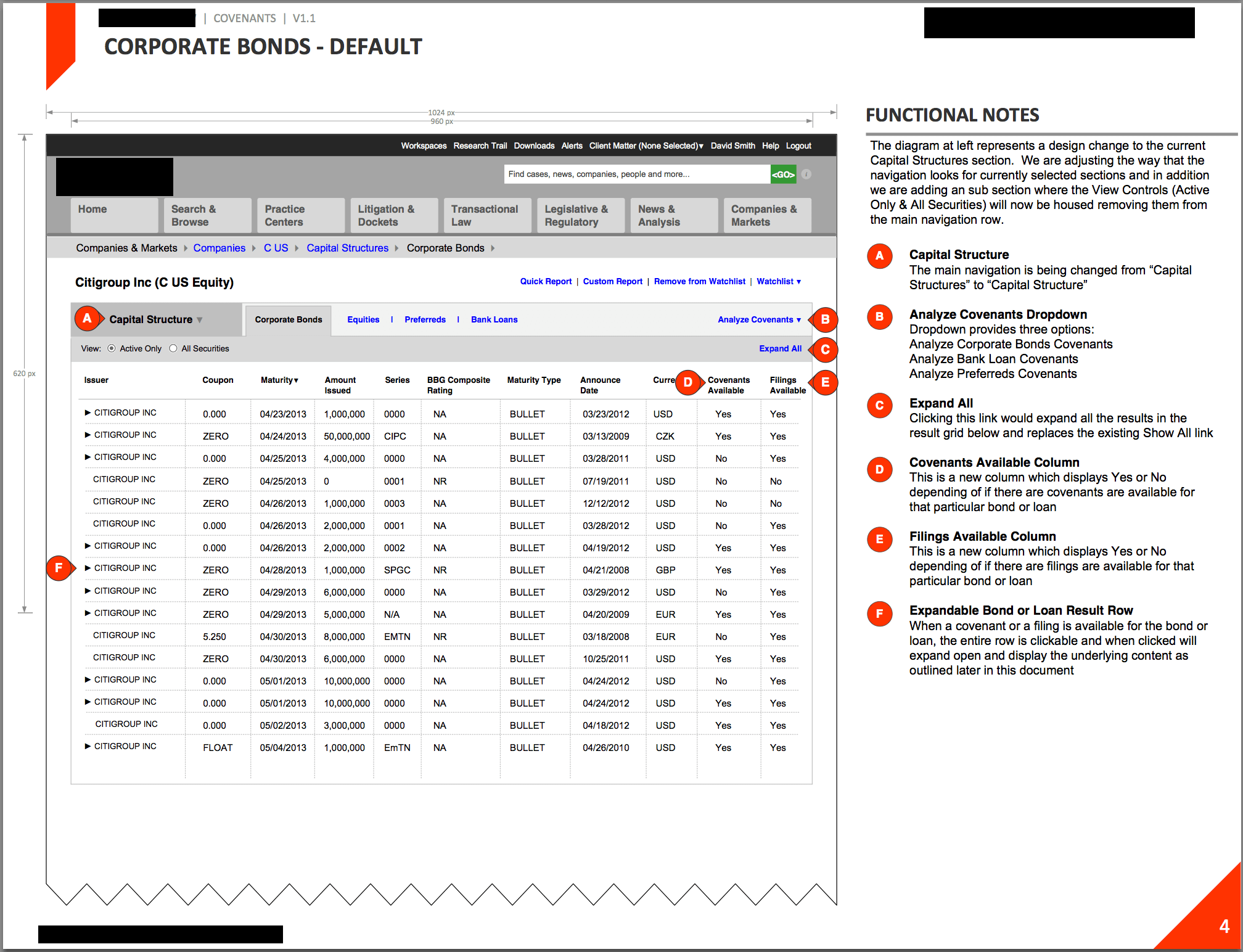
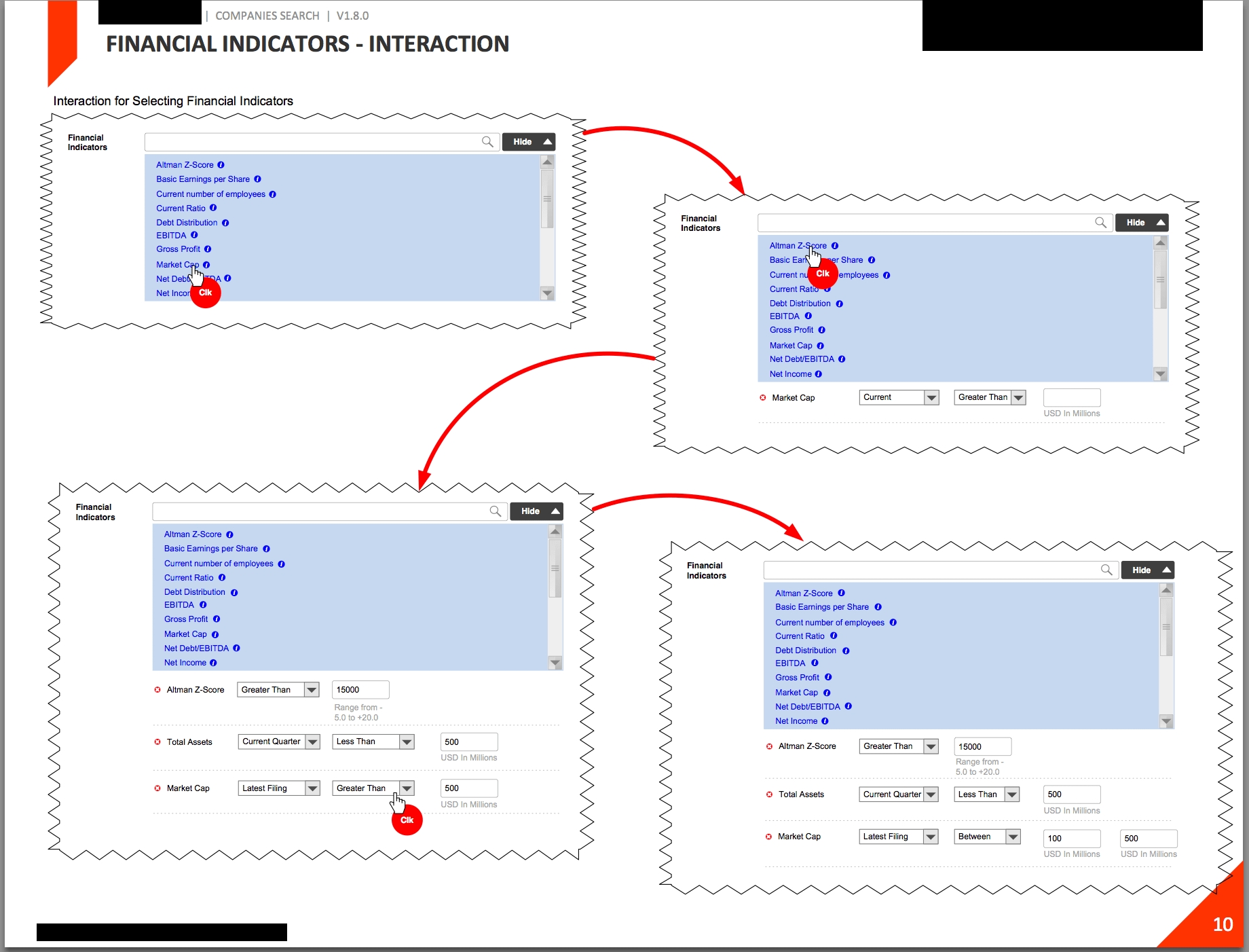
Developed and deployed a new methodology and process for delivering, reviewing and approving wireframes, visual designs and annotations currently rolling out to various projects.